Brand Identity
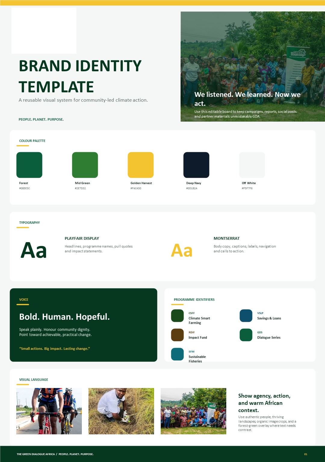
Built the visual system, colour palette, Playfair/Montserrat type pairing, voice, photography direction, and logo usage.
/ Case study, Brand & Website
A full brand identity and website for a community-led climate-action organisation, and a place I know from the inside, because I also serve there as an administrator.
The Green Dialogue Africa works alongside communities to build climate resilience and strengthen livelihoods. They needed a brand that felt bold, human, and hopeful, and a website that turns visitors into participants.
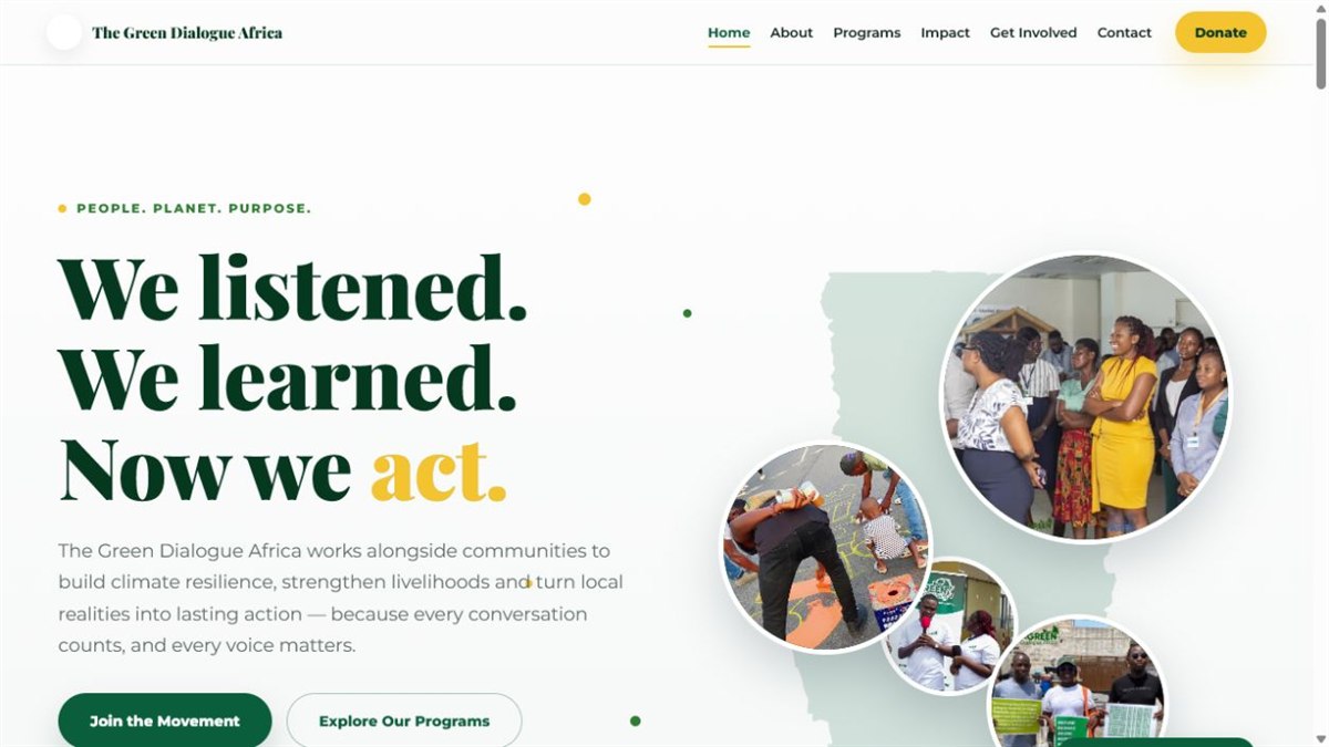
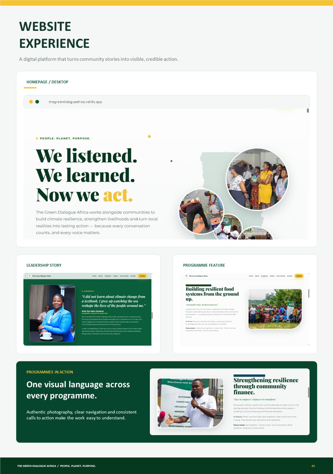
I built the visual system and the site around one idea from the community work itself: "We listened. We learned. Now we act."
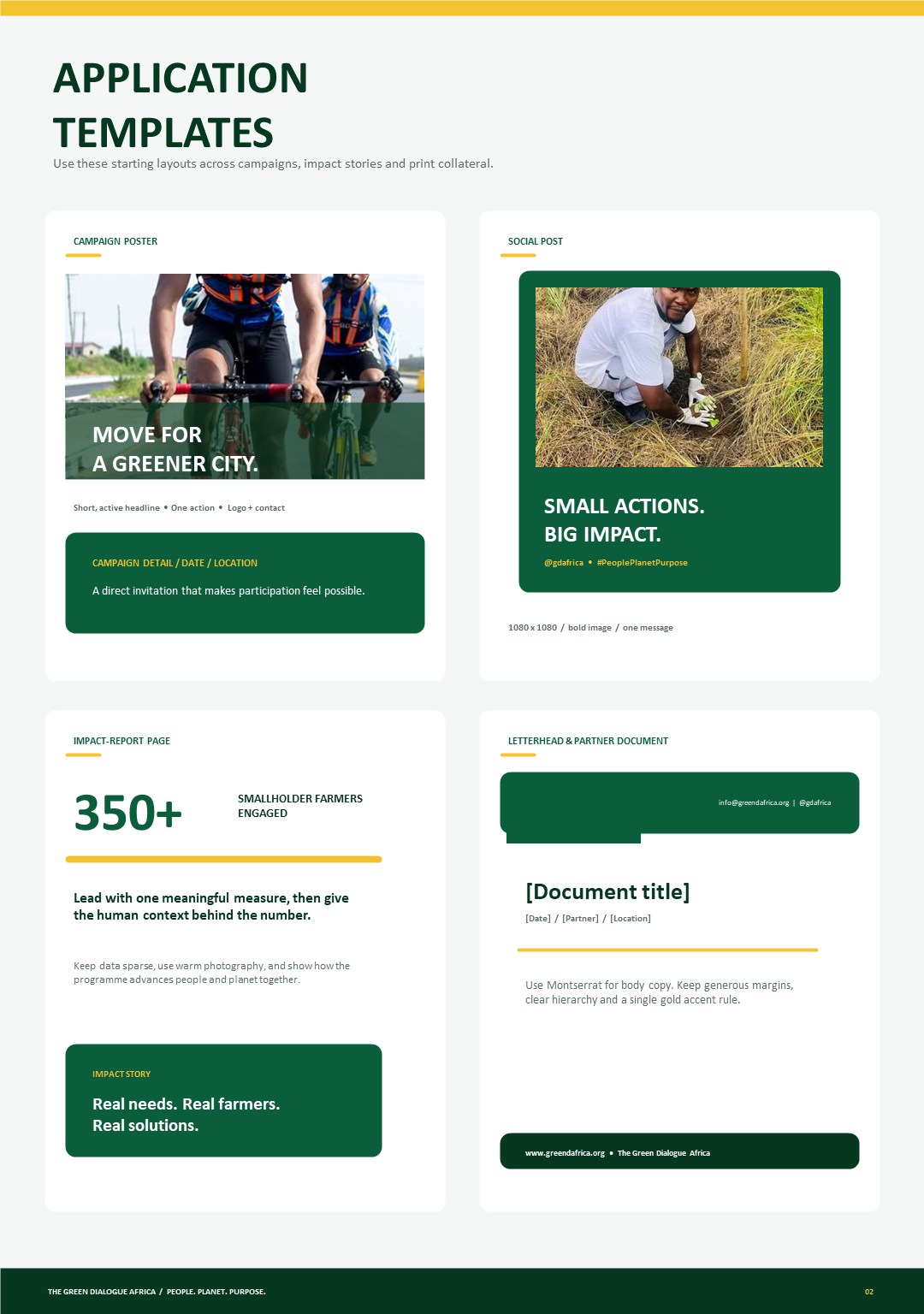
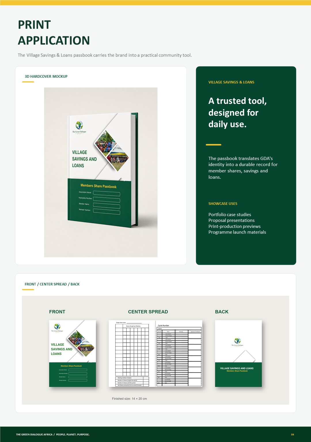
A reusable visual system for community-led climate action, colours, typography, voice, programme identifiers and ready-to-use templates, all documented so the team stays on-brand without a designer on call.
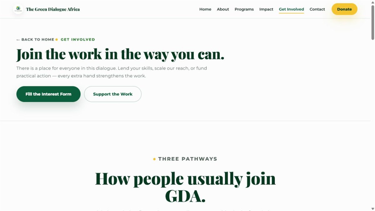
Designed and built as a full multi-page site, Home, About, Programs, Impact, Get Involved, Donate and Contact. Live at thegreendialogueafrica.netlify.app ↗
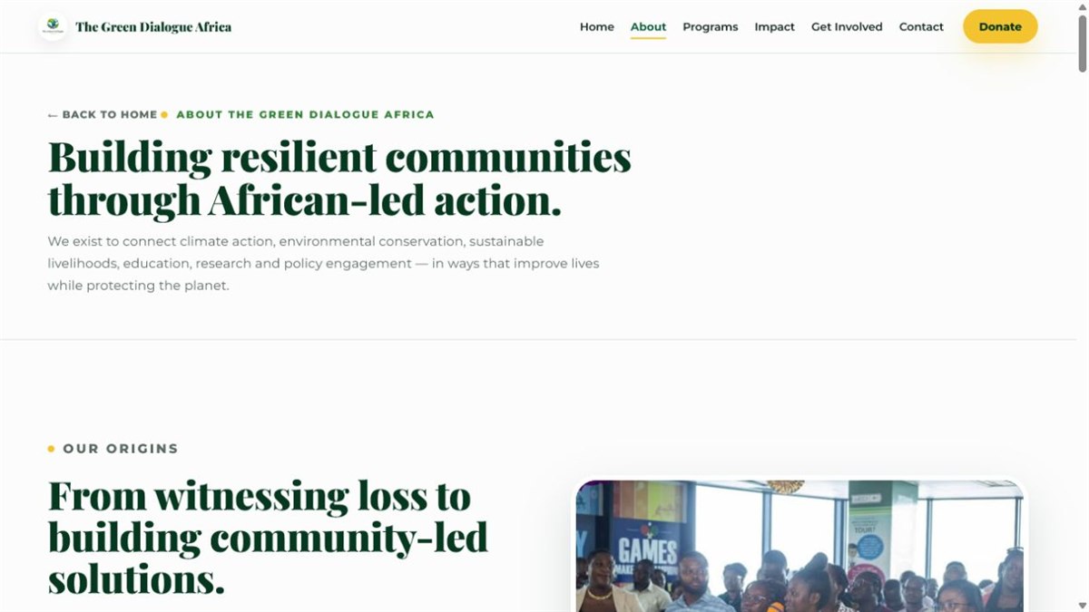
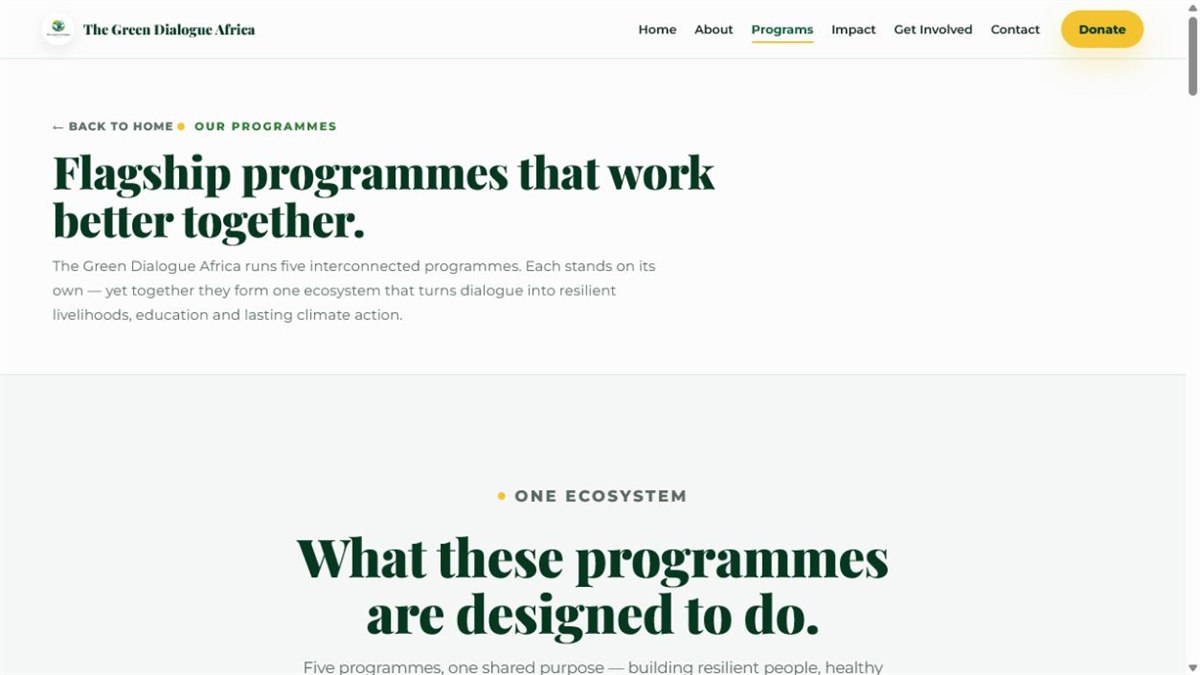
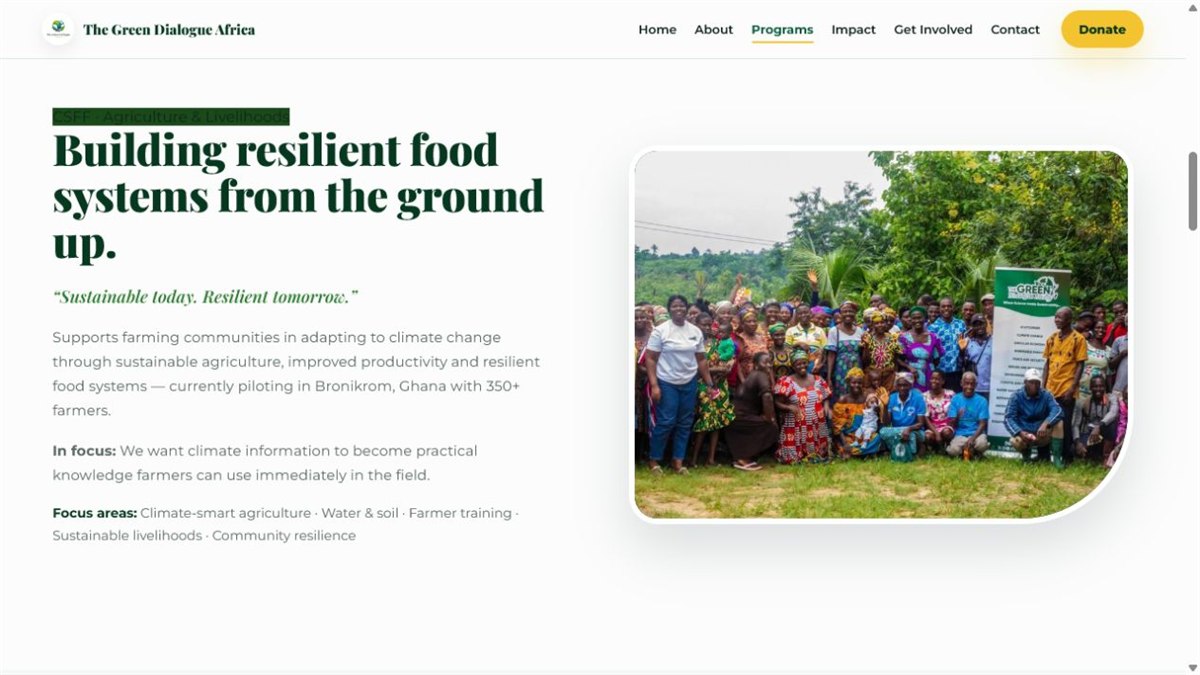
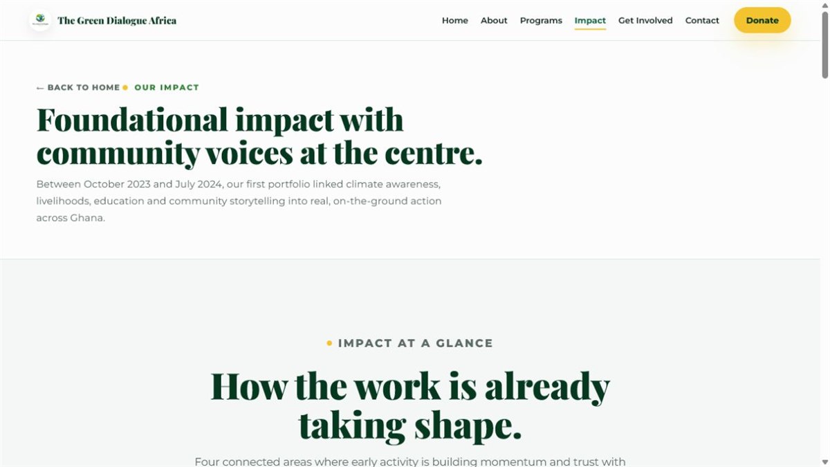
Built the visual system, colour palette, Playfair/Montserrat type pairing, voice, photography direction, and logo usage.
Designed and built the full multi-page website, from the "We listened. We learned. Now we act." hero to donate and contact flows.
Created a colour-coded identity system for the programmes, CSFF, RDIF, SFM, VSLP and the Green Dialogue Series.
Letterhead, presentation decks and brand templates so the team communicates consistently without a designer on call.
I also serve as an administrator at the organisation, supporting content, communications and day-to-day operations.
Documented it all in a brand identity guide so the system stays consistent as the organisation grows.
I take organisations from identity to live site, designed, built, and documented.